
One of the things that drive me crazy is seeing perfectly good marketing ideas mangled and destroyed with poor design. I won’t show samples to protect the guilty, but I will show you examples of GOOD design. Good design supports your marketing goals and helps you get the best results possible.
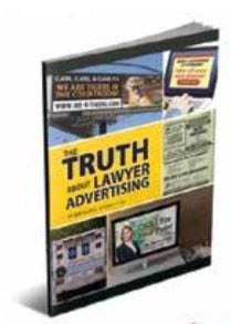
Books and reports (also called consumer guides) are a very important part of your marketing. They serve as the key offer in your lead generation marketing. This type of offer automatically sets you apart from all the other professionals advertising their business. Also, authoring a book creates authority and status, and demonstrates your expertise — there may be hundreds of other business owners, but YOU wrote the book.
In addition, your book is often the first touch to a prospect. It’s the first thing they get and the first impression they form of you. So it should look professional and communicate the brand you intend. Your brand isn’t just how something looks, but it’s the overall message and experience that your market has with you and your practice.
Let’s break down the marketing principles to consider when creating a book.
1. Book Title
The title of your book should be clear and written to evoke curiosity. The problem I see with most books is the title is too vague or too clever. A few years ago, I finally convinced a friend who is an insurance agent to write a book. He wrote a book about the importance of life insurance and titled it Sleep Well. “It communicates peace of mind” he explained. Unfortunately, he wouldn’t be persuaded to change it to something more direct and clear. Today, he is likely attracting people with sleep disorders. If it needs explaining, don’t use it.

This cover for Diamond Practice Builder Frank Kearney (Family Law, Washington D.C.) has a family-friendly, happy design to temper the difficult issues his clients are faced with. The title speaks to the outcome parents want. The text is clear and the image is unique.
2. Legibility
Next to a crappy title, the biggest mistake I see in book cover design is tiny or illegible text used for the title. Remember, you are writing a book to get leads, not to get on the New York Times Best Seller list or win an award. That means your book should stand out in your advertising. When your title is so small that you can’t read it at thumbnail size (on your website for example) you lose the visual impact of the ad. I had created an online ad for a book offer, and because the title was so small, I had to re-work the copy to make sure the topic of the book was clear. I would’ve preferred to use the copy space to talk about a more compelling idea. But, alas, it was wasted on explaining the book because the book cover failed to do so.

Kevin Healy (Personal Injury, DE) gives his book exclusively to doctors to give to their patients. The cover and the title appeal strongly to doctors which makes them more willing to give to patients.
3. Emphasis
Sometimes, the emphasis isn’t on the right word or phrase. So the first idea or thought that jumps out at the prospect when they look at your book cover is not the most impactful. This is also called “hierarchy.” When you look at a book cover (or any design), what is the first thing you see? The second thing The third? And so on. The title should be the most prominent element on your book. Within the title, are the correct words/phrases emphasized? Do the line breaks make sense? Or do they interfere with the clarity? And please, do not put a giant version of your logo on the front cover. Just. Don’t.
Personal injury attorney Ben Glass’s books draw attention to the graphics which tell a story. The titles and the balance of the graphics and don’t compete. Also, they are legible and the correct phrases are emphasized.
4. Image
You don’t have to use a photo or image on your book. You can make some nice covers without any images. If you do use an image, stay away from dull, predictable stock images. It’s fine to use stock images, but use something that has character and personality and makes people look twice.

Robert Malove (Criminal Defense, FL) dared to be edgy with a compelling title and “in your face” (literally) graphic, all designed to demand attention and action.
Beyond the cover design, there are other factors to keep in mind to ensure your book supports your marketing. Do you have a compelling copy and bio on the back cover? Is it clear to the prospect what their next step should be? The books and other lead generation pieces you create should never be a one-and-done deal. They are assets that should be used continuously in postcards, newsletters, online ads, print ads, and other media to attract leads and build a strong list of prospects who will eventually hire you and refer others to you.
If you’d like to know more about how design can make or break your marketing, request my popular book, Five Ways Your Design Can Be More Seductive.